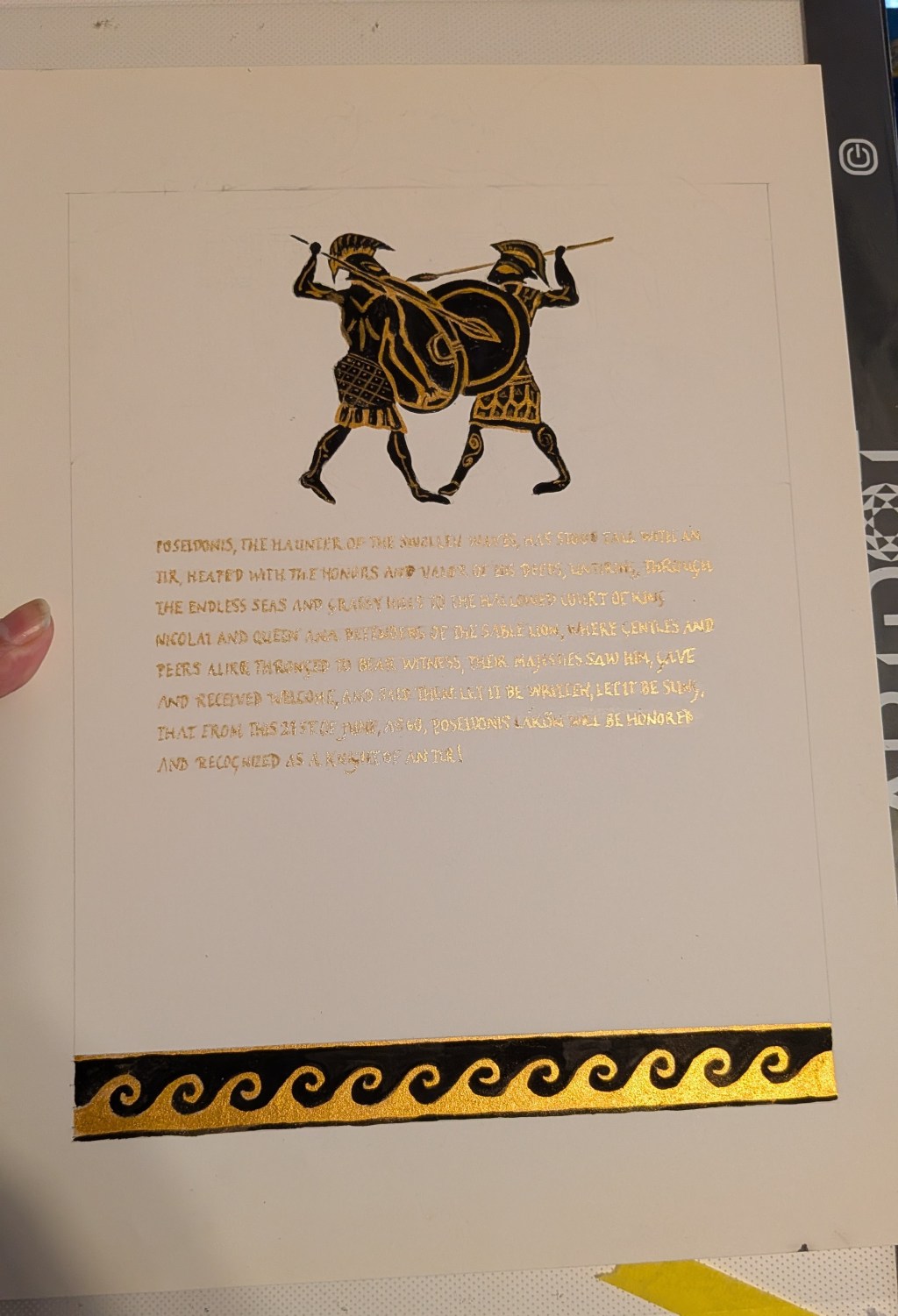
Now that it’s been awarded at June Faire, I can write about my first-ever kingdom scroll. This was a knighthood scroll awarded to Poseidonis Lakon.
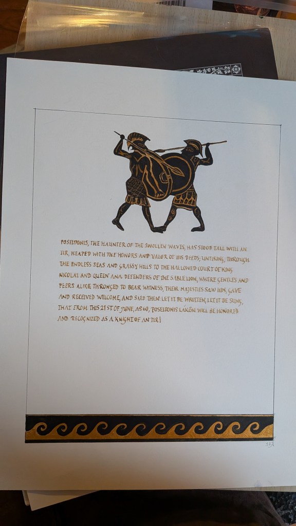
For this scroll, I looked over a lot of Greek pottery designs. Originally, my intention had been to use a largely black field with gilded copper. However, the more that I looked at early Greek art, the more that I realized the beauty of it was in its simplicity. And while the design I finally settled with is more simplistic than many scrolls are, I felt that this honored the original artforms. (Though yeah, I couldn’t resist making up for that simplicity with a whole lot of gold.)
In the end, I went with an illustration of warriors at the top to honor the knighthood and a wave illustration at the bottom for Poseidon. Those elements were done with Beam Paints’ fairytale gold and black gouache. Where I’m going to write a bit more related to this particular scroll, however, is the gilding aspects.
I’d inquired if the text needed to be translated into Greek and was told that wasn’t the case. I debated a lot about what handwriting to use as I’ve read a lot of debate about faux alphabets and I also wanted this to be readable to the modern eye. In the end, I went with a rustic Roman alphabet despite the fact that it wasn’t Greek. There was a lot of intersection between the Greek and the Roman world and this felt better to me than the other hands that I looked at.
Because the design is so simple, I felt justified in gilding the whole text. So every letter in the scroll is 23k gold. I added a sealing coat to avoid tarnishing. The image below shows the various stages in the process I used.
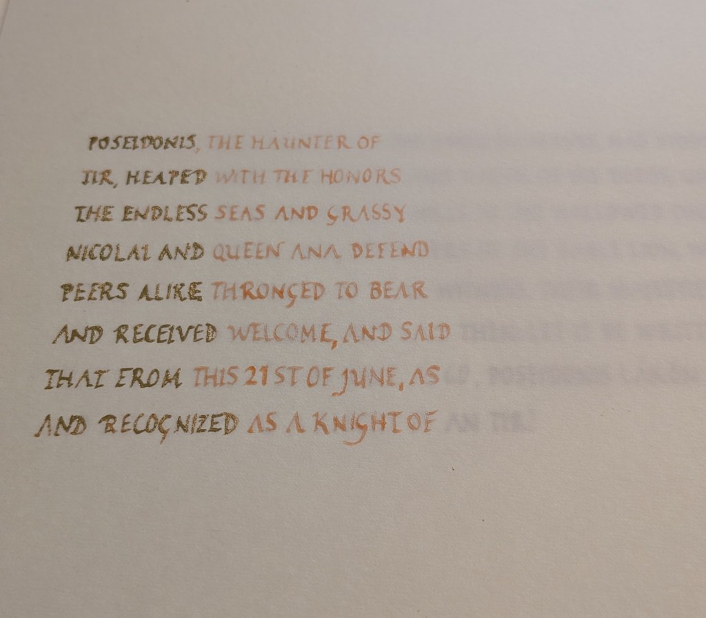
My first step was to handwrite out the calligraphy using a dip pen on lined paper. After it dried, I then taped that down onto a light pad and secured the scroll on top of it.
Using a dip pen and miniatum ink, I traced over the text in sections. One thing I have learned is that it’s better to go up and down, then left to right in terms of the gilding as it makes for a more efficient use of gold. As you can see in the image, I was gilding in the rough shape in which I was slicing my gold leaf.
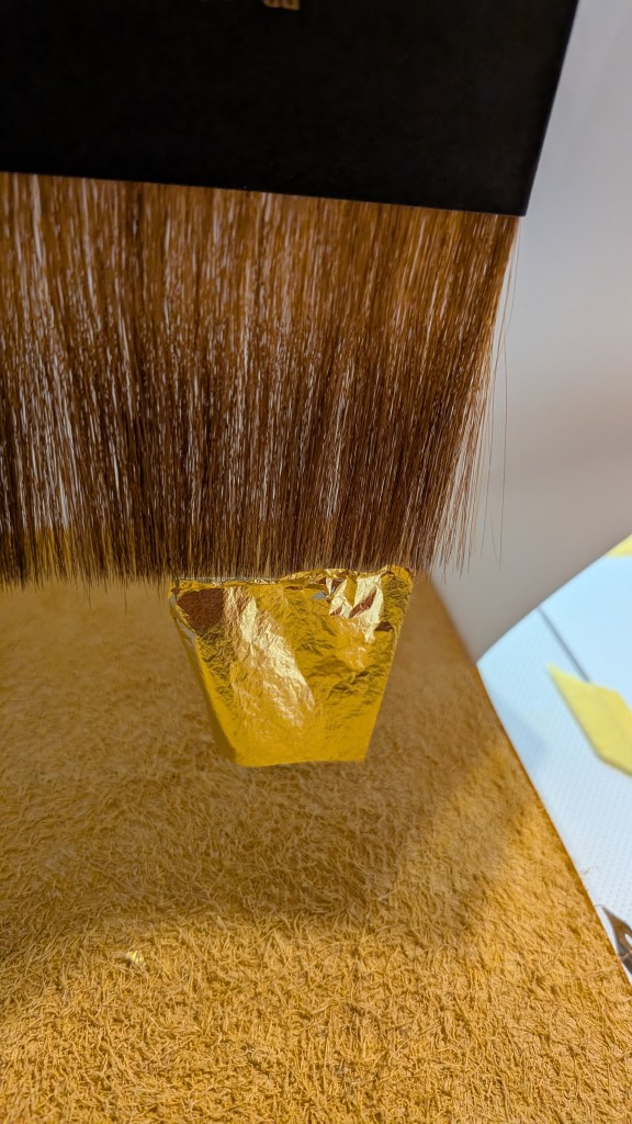
The leaf I was using is very thin (as is typical unless using a double leaf and even then, it’s still thin). I wanted to minimize the amount of touching the actual leaf and also the amount of gold loss, so I did use a gilder’s tip and cushion to apply this.
First, I gently rested the gold against the cushion. Then I used my gilder’s knife to slice into sections that would then be applied.
Miniatum ink takes about 15 minutes to be ready. You can tell when it is ready for gold by the fact that it doesn’t look shiny anymore and feels a little tacky to the touch. Once each section hit that point, I used a paper straw, breathing from the back of my throat, to warm the ink for gilding.
After that, I brushed my gilder’s tip against my skin to pick up oils that would pick up the gold. I then picked up the gold and gently rested it across the ink. I often use a bit of glassine paper on top, then tamp it a bit with a cotton ball. After it’s rested for a bit, I use a soft brush (ONLY used for gilding – can’t stress this enough) to brush away the excess gold. I’m saving that gold to someday make shell gold, but that’s a post months down the road, I am sure.
It does take quite a long time to do a scroll in this way as I prefer to work in smaller sections and take it slowly when gilding. But it makes for a beautiful effect.
Note on supplies:
The paper for this scroll was Arches Cold Press watercolor, 140 lb.
I obtain my miniatum ink from John Neal Books.
I used 23k gold leaf for the text and applied using a gilder’s tip and cushion due to the fragility of the leaf.
The paints used came from Beam Paints, created from natural pigments. The “gold” used in the figural illustration was their Gete Dbaajmowin Zhonia’ande (fairytale gold), made with mica.

Leave a comment